How to explain difficult things more easily
Written by Lubica Drangova on January 24, 2017
Doesn't matter if you are a teacher, scientist, journalist, businessman, NGO representative, or logistics company CEO. From time to time, you deal with difficult topics which are hard to explain to others. But how to make it understandable for many people, if you want to avoid long readings?
As you read and heard many times before, we live in visual culture. So many things go through our eyes, that the brain is totally attacked by pictures. We became kind of lazy to read and to try to understand. Because of lack of time and the phenomenon of visual communication (even Facebook recently started colorful posts) we prefer to communicate and read in pictures, videos and symbols. So how to deal with these circumstances, if you want to explain something more complex and important and a static picture or text is not suitable? Cleverly designed interactive visuals are a tool worth considering.
A couple of comparisons of static and interactive visuals
Graphs and diagrams started to be quite popular not only in scientific hoods and schools. You can get data for many things and if you have good tools, you can transfer them to information and explain them to people so they get it. But it is not that easy. Data are not sexy on the first sight. They definitely need some way to explain them and touch peoples’ soul. At least a small accompanying text. I use the word data as an umbrella term here and specialists might have some regards, but for simplicity, imagine these as not just numbers, but also as facts and relations. Let’s get to an example. Obama and yearly job growth in the States. Down here you can see a standard graph, which, not looking at some visual missteps, might be OK for printed media.

What could be done differently? Similar data, but different approach. The New York Times got it a little bit more cool by making the graphs interactive and visually pleasing. Oh, how I love their intro in the beginning of the article. Draw your guesses on the charts below to see if you’re as smart as you think you are.
What makes the biggest difference for me comparing to previous graph is my cognitive involvement enforced by the solution. This is great way to see not only facts about how Obama did during his years of presidency compared to Bush years, but also how you personally felt it and thought about it. It really makes you think and analyze.

Cleverly designed interactive visuals are a powerful tool.
Sometimes it can be even more playful and interactivity could be used just as a tool for involvement into topic, not necessary explaining. For example, Nicky Case made this lovely interactive explanation of how Cognitive Behavioral Therapy works. Go ahead, have some fun with neurons:
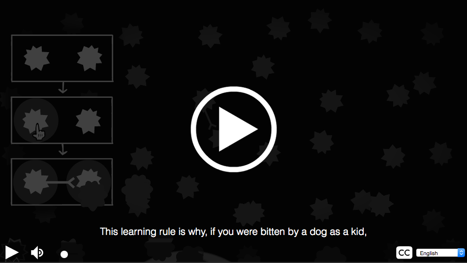
You can compare it with the following diagram, which tries to explain the same thing. If the ultimate goal of these 2 representations is to teach me something, the interactive version not only explains things better (not leaving place for many assumptions). It also helps me remember the acquired information easier by accompanying the message with a story. There are examples I can play with. A voice which guides me through the process. And very likely, neither me, nor you have ever seen anything similar before. On the other hand, I saw generic diagrams so many times before, that they are already pretty mixed up in my head and even make me tired.

If you put together facts, fancy visualization and interactive features, you will be able to send a very clear message out there.
More examples
Another fancy data visualization appeared on British website Simplybusiness.co.uk – a microsite named Hungry Tech Giants. This website goes through acquisition strategies of five big IT companies. You can even choose from different categories! Just play a bit and see when the giants had some small software company or a big media company for lunch. Some smaller or bigger news about companies acquisitions are mentioned regularly in media. There are even lists of companies. But how to get a bigger picture of who bought who through the years and really see the scale? Well, Simplybusiness.co.uk have done pretty good work.
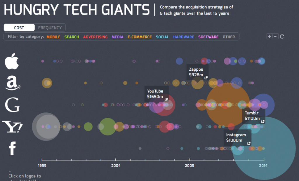
I can’t avoid big words like with one picture online application you can say it all or something similar. But honestly, it is more or less like that.
These years media are full of migration and immigration. So maybe, lets nail up this article with this breath taking map from Max Galka. Here you can see the migration pattern from last five years.
Direct flights from Bratislava
Since we are very into this topic of interactive graphics and the winter in Bratislava was biting a bit too much this year, we got this idea to warm ourselves and make a visualization of direct flights from Bratislava. Can´t forget to mention, that the idea came up after sitting over coffee with Dana Bubak. We made a map where you can see all direct flights from Bratislava in the actual month and you can filter them by length and the temperature you want to experience when you land! Also, by hovering over the destination, you get information about airlines and exact numbers. Enjoy!
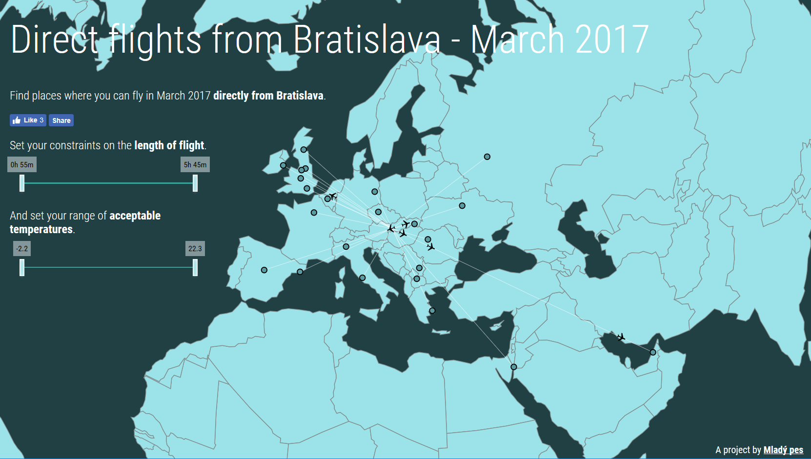
Map of direct flights from Bratislava. Interactive version here.
If you have any idea which you want to explain by interactive visuals or a interactive web application, maybe we can help you. Don’t hesitate to contact us.
Tweet